An ad creative is delivered on a webpage, social media, app, or another platform to a targeted audience. These are typically known as display ads, which are used to drive business objectives, such as increasing website traffic or sales.
What actually is ad creative?
Interactive Advertising Bureau (IAB)’s Advertising Creative Guidelines recommend that “ads should be distinguishable from native web content”. It has to be seen as a banner with visuals and text that promote your brand, product, or service. The viewer would know at first sight that if they are enticed and click on your ad, they would be directed away from their current page.
Creating ads is about finding a balance between being attention-grabbing, but not obnoxious, offensive, or god-forbid — forgettable!
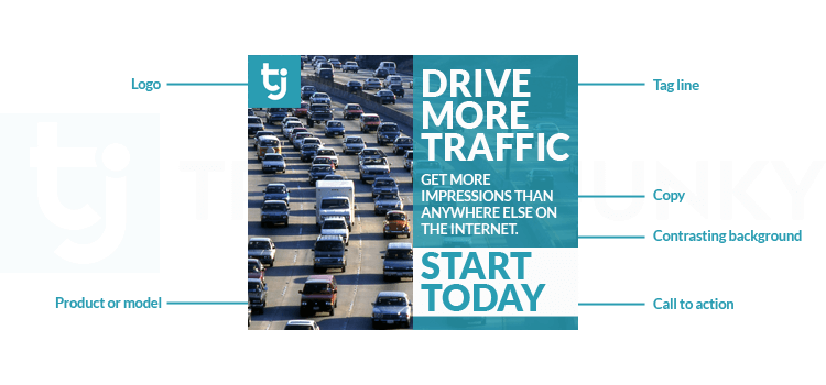
Here is a breakdown of a well-balanced ad:

As you can see in the graph, the vital components of an effective ad are:
- Image of your product or service
- Ad copy: tagline & value proposition
- Logo design and/or brand name
- Call-To-Action
What are the main ad creative elements to consider?
Ad creative size
- Countless amount of ad networks available
- Various types of devices (desktop, mobile, tablet etc)
Audience reach is an important factor in advertising. This is why as marketers, we need to create ads in a variety of sizes. it guarantees more flexible ad placement across the internet and serves a seamless viewing experience!
Create a variety of ad formats. According to Google, the top-performing ad sizes that get the most ad impressions are:
- 300×250
- 728×90
- 160×600
Ad creative visuals
Let’s be honest: human beings are visual creatures.
“A picture is worth a thousand words” rings especially true when it comes to your ad imagery.
Pictures help people visualize the offered product or service.
Whether you’re using popular free stock images or getting a photoshoot done for your ad, here are some pointers:
- Showcase your product, service, brand, and/or environment clearly
- Match your image to your ad copy AND landing page — they should all share the same look and feel while conveying your message
- Avoid gloomy imagery – we encourage using a brighter tone
- If people are featured in your ad imagery, try to feature models that match the demographic you are targeting
- If the focus is the view, we recommend using tiny to middle-sized figures to allow the focal point to be the atmosphere
- If the focus is the activity, use middle to large-sized figures to demonstrate the experience
- People are naturally attracted to images inside boxes. If you have an ad with a white background, consider outlining your ads with a 1px (minimum) line to frame it
- If you have a promotion, highlight it in the image with text and keep it concise. Eg. 20% off, 2 days only!
- Keep the text light in the image. Try to keep it under 20% of the space on the visual
To avoid ad fatigue, freshen up your campaigns with new imagery to keep them fresh!
Ad creative colors
Color has a powerful effect on human emotion and a viewer’s perception of a brand. When color is correctly and consistently, it can create a positive impact and make a lasting impression.
You can use color to:
- Grab people’s attention
- Define brand identity
- Associate your product or service with a specific emotion or feeling
Imagine a bank with a bright yellow logo or a feminine hygiene ad that had a brown-colored background. It feels a little “off” as it doesn’t align with our expectations for specific products or brands.
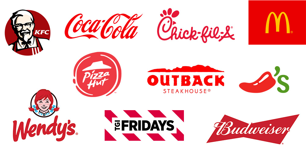
Why is this? Aside from social conditioning, a lot of these color-based expectations are rooted in our biological programming! For example, red is often used by food chains or brands because bright red is like fresh meat or fruit that’s ripe and ready for us to eat.

Here are the popular colors, what sense they’re typically associated with, and common uses:
Red
- Energetic and passionate
- Common uses: food products or brands, clearance sales
- Authoritative and trustworthy
- Common uses: businesses and financial institutions like banks
- Optimistic and youthful
- Common uses: window shopping signs
- Calm and mature
- Common uses: eco-friendly brands, wellness spas, and products
- Bold and assertive
- Common uses: Call-To-Actions like Buy or Subscribe
- Sensual and mysterious
- Common uses: luxury products, sexual wellness products
- Romantic and often associated with femininity
- Common uses: pastries, branding for feminine products or services like beauty, hygiene, etc
- Sleek and luxurious
- Common uses: high-end, luxury items such as cars, watches; used as a contrasting background to make the focal point stand out
A survey was conducted, and results show the general public’s favorite and least liked colors:
- Blue
- Green
- Purple
- Red
- Blue
- Green
- Purple
- Red

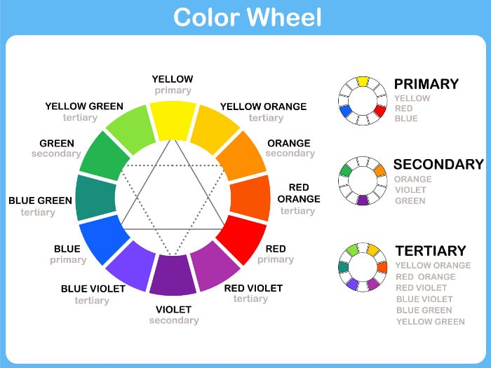
This is a Color Wheel and how colors relate to one another.
We recommend using a color contrast. Why?
- It’s visually more interesting.
- It can get viewers to focus their attention on specific elements of your ad. This could be a particular keyword, icon, or Call-To-Action button.
Complementary and Split Complementary uses colors that are found across from each other on the color wheel.
Here is an example of how color contrast can work well visually:

Ad creative copy
- It provides context
- It complements your ad image
- It encourages and guides people on what to do (for example, click to your website)
When you are planning your campaign, think about your key messaging. What is it you want to convey? The ad image and headline work together to stop people in their tracks. Your ad copy should be a value proposition. You will address your target audience’s pain points and present why you’re the best solution.
Successful ad copy means people instantly understand:
- What you’re offering
- How do you benefit them
- What the next step is
Here are some pointers on how to polish up your ad copywriting:
- Ensure your copy complements your ad image and tells your story
- Your audience should clearly understand what it is you’re selling
- Write as if you’re directly speaking to your target audience
- If you have different audience segments, create separate ads and tailor your ad message for each audience demographic
- Keep it short and sweet: use easy-to-understand language
- Avoid using ALL CAPS
- Incorporate price, promotions, and exclusives to let people know about your great deals
- We highly recommend highlighting a deadline for any discounts or promotions to create a sense of urgency. Eg) 3 Days Left for BOGO!
- Incite the audience to take action with emotional triggers. Here’s a list of 170+ Power Words to Write Emotional Ads
Ad Creative Call-To-Action (CTA)
A Call-To-Action (CTA) tells your target audience what action to take and how to take it. It is typically a phrase framed in a hyperlinked button that directs the user to a landing page.
The two main purposes of a CTA is:
- To tell someone what they should do
- To give someone motivation to do it
The first word of the CTA should be the desired action. Here are examples of categories of common CTAs:
Newsletter or Resource: Subscribe, Download
eCommerce: Buy, Shop
Lead Generation: Sign-Up, Fill Out the Form
Fundamental Tips for Creating a Strong CTA
- Use a contrasting color from the text to make your CTA button stand out.
- Keep CTA text between 2 to 5 words.
- Capitalize every word except for articles such as “a,” “and,” “for,” etc.
- Use words that indicate a timeframe like “now” or “today” to add a sense of urgency.
- Try adding an exclamation point to the end of the CTA for extra enthusiasm!
- Consider customizing CTAs for different devices (Desktop vs Mobile), for example, “Call Now” for mobile and “Find Out More” for Desktop.
- If you’re advertising to a cold audience, use a softer CTA such as “Learn More” instead of “Buy Now”.
- If you’re running a retargeting campaign, go with a stronger CTA like “Apply Now”!
- Softer approaches like using first-person speech might appeal to audiences. Compared to “Book a Consultation”, “Get My Offer” might be more personable and gives the audience the feeling that they have more control over the decision-making.
Wrapping up...
There you have it! We hope it was insightful and that you might apply some of these tips to your future ad creatives!
For more advertising resources like this, check out our Advertising Institute Library, or subscribe to our newsletter and get our latest blogs delivered to your inbox!
Let's Work Together
Say hello to customized advertising strategies that convert.
Get in touch with our programmatic experts today!


